Wednesday, December 22, 2010

My Favorite Artist of The Past


Although Van Gogh's paintings are in a style that is different than my way of working, I find a great deal of inspiration in them. There is also a great deal of freedom in them. Although he studied with others, he wasn't bound to the rules established by others, and made his own way. In the present world, his work receives much criticism, sometimes even from artists. However, when I go to the museum, I find that I study his works more than others.

As for his eating paint, well, I wouldn't do it, but hey, it does smell aweful good! At least if made with linseed oil, and I don't think he ate much.

The painting above is an attempt on my part to copy one of his self portraits. Probably a poor attempt, but I just respect his beliefs, and work so.

Sunday, December 5, 2010

Making Paint: Sedona Earth


Oil paint is mainly pigment, and drying oil, and at times a stabilizer. I think that an oil paint with some form of stabilizer makes a better paint. The oils are poppy, safflower, walnut, and linseed. Many artists use different oils, for different reasons. I generally prefer linseed oil. It is very durable, and has been used successfully for centuries. Safflower is very good at mitigating the yellowing effects seen with linseed oil. For lack of a better explanation, I love the smell of linseed oil, and when it comes to making paint, the cold pressed version is excellent. Cold pressed linseed oil wets pigments better than alkali-refined linseed oil. When made in factories, this is no concern, but I have found it much more effective when making my own paint.

Several years ago I was on vacation in Arizona, and visited Sedona. It was red! A beautiful iron oxide red, everywhere. Immediately I thought that the sand would make a very nice color in paint, so I collected some in a plastic bag.
I took this material, and cleaned it several times to remove organic material. I then baked it to dry, and although it was already very fine in particle size, I ground it down much further, to the texture of my other dry pigments. When sufficiently ground, I added cold pressed linseed oil, and ground the pigments into the oil. Somewhat gritty at first, they did break down into even smaller particles, with a great deal of effort, and time. The thing that was most interesting is that as the particles became smaller, the color of the paint darkened. In the end, it was very dark, and didn't appear red at all. More of a burnt umber color, but with much different working properties. When mixed with white, it does have a red hue, but there is a notable shift to yellow. In mixing this color with venetian red, and titanium white, it produced a flesh tint that was so right on, with relative ease, that when I wiped the paint laden brush on my hand, the color was indistinguishable from the local skin color. When mixed with ultramarine blue deep, a wonderful black results, and I have found this black to be very close in hue, and working properties to the actual ivory black, made from actual ivory.

Considering the amount of effort and time that went into this, I don't think I will make a huge amount, but it was a good experience, in keeping with the craft. The amount that I produced after about 8 hours of work, was approximately 35ml. A similar amount to a single tube of paint, bought in the store.

The remarkable thing about this paint, is that although enmasse, it resembles burnt umber, or any number of mixes, the working properties create a much more subtle effect. It is not overwhelming in the least, nor is it gritty. I would add that as a stabilizer, I used a very small amount of amber varnish that I made earlier this year (about the size of a lima bean). It immediately congealed the paint, and made a wonderful texture. This truly is an earth color. Please excuse the pile depicted, as it does resemble another less than desireable substance.

Sunday, November 21, 2010

Don't Die For Your Art


This painting is 18x24 inches. It is on a support of burlap laid down on hard wood panel. One of my favorite subjects, this group of bison except for baby has been familiar to me for years. I got relatively close to them to complete sketches. Baby appeared quite interested, and studied me. She came quite close on several occasions, and the adults appeared to be getting more nervous as time went on. This is a large male bison, and a female baby, recently born. He appeared very gentle with this baby, and never took his eyes off of me. They finally had enough of me, and the entire group started moving toward me, and I decided to head back for the fence. They moved quicker and I felt the heels of my shoes hitting the back of my shoulders. I dove through the electric fence, and rolled. Dirty, but happy to not have a bison horn stuck in my ribs.

The colors for this painting were cadmium yellow light, yellow ocher, burnt sienna, burnt umber, red iron oxide, ultramarine blue, cobalt blue, titanium white. The medium was amber varnish, added in small amount to the paint nuts, to stiffen them, and create a more impasto effect. Since the support was burlap, with large interstices, it took a great deal of paint. There is still more work that needs to be done; mainly with the backgound tree line, and in the fur.

Thursday, November 18, 2010

Practice


This is a little further along that the image below, but still a lot to do. Much detail work, including slight color and value changes throughout. Without the gradations, the form would be off. This is the stage of a painting when it helps to have very good quality paint, that is highly pigmented, and a has a loose texture. The changes will need to be scrubbed on thin, but a medium will also need to be added, to insure proper adhesion, and to protect the integrity of subsequent layers, by the addition of increasing amounts of oil, with each sucessive layer.


This is an 11x14 oil painting, for practice. For this one, I am working in layers. Rather than my usual charcoal drawing, which is then fixed with shellac, I used a toned canvas panel, and drew with paint and brush to establish shapes. Then I painted the image. When this is dry, I will change brushes, and focus on details, including values and color.
The paint for this was titanium white, burnt umber, burnt sienna, raw sienna, Venetian red, yellow ocher, ultramarine blue, and cobalt violet. I made the titanium white and Venetian red by hand. The Venetian red pigment came from Sinopia, and the titanium white was from Kremer Pigments.
The mediums for this were cold pressed linseed oil, and a medium composed of stand oil, Canada Balsam, and oil of Spike.

Tuesday, April 13, 2010

Repair of an Icon (Finished)


This is an image of the finished repair of the damaged icon, shown below.
Many months later, and after a great deal of work, the repair was completed, and the icon was delivered back to the Cathedral. They were happy with the repair, and I was very relieved.
This painting was quite interesting, as it was originally completed in layers, using glazes and scumbles. In repairing the image, it could not be painted alla prima. In order to match the surrounding undamaged areas, the image had to be painted in layers as well. I used Winsor and newton oil paints, and an alkyd medium, for the glazes. A year after the repair was completed, and the paint sufficiently cured, I varnished it with a synthetic varnish.

Repair of an Icon

I thought that I would post before and after images of a repair that I completed for The Annunciation Greek Orthodox Cathedral, in Columbus, Ohio.


The first image is of the damaged icon. The icon was painted in oil on canvas, and not the traditional tempera paint on rigid support. Although it is old, it was completed in more of a Western style.


I was told by a church representative, that the icon was damaged by young people playing with a ball, that inadvertently got away from them. This left a significant tear in the image. The church then contacted an artist who reported to them that he could repair the image. I was told that the restorer soaked the painting in water. I was told that this restorer subsequently went to lunch, never to return. Apparently as the painting dried, the paint film surrounding the tear delaminated from the shrinking canvas support. I was asked if I could repair this piece, and although at first I was a bit over whelmed, I took on the task, and set to work.

This task at times seemed almost insurmountable. The damage was extensive, and there were literally hundreds of highly detailed tasks that had to be completed.

Tuesday, March 16, 2010

Red Cloud


Red Cloud is quite an impressive creature. I had never been up close to a bison before, and had always thought of them as more or less a big cow. Well, they may be in the same family, but they are certainly not a cow. They seem to have a personality, and although he is big, he has kind eyes, and seems somewhat friendly. I wasn't deluded into believing he wasn't dangerous, but he appeared much more friendly than the ranch's other dominant male Crazy Horse.

Funny thing about bison, is they are very watchful, and as I sat sketching them, I found that they were all facing and watching me. Who was studying who? I have never observed any group of animals do this, and it was quite eerie. What impressive creatures they are. The only megafauna to survive the last ice age. Standing near them convinced me that they are tough as any creature on earth. The hump on their backs belays the power they can generate, and the size of the head is what amazed me the most. Unlike cows and farm animals, they have no need for a barn, or shelter, and can survive just fine in the open outdoors. They do stand shoulder to shoulder and face the wind together, as they have very thick hair on their heads, and they conserve their body heat.

Perhaps they are an example for humans to follow. Perhaps if we stood shoulder to shoulder and faced the winds together, the world would be a much different place.

This painting was inspired by Red Cloud. It is 8 by 10 inches, oil on cardboard canvas. I also used amber varnish, in the paint. It is thin in the darks and impasto in the lights.

Saturday, March 13, 2010

Pears


Paired Pears. This is oil on canvas coverd wood panel. It is rather thick, and completed with hog bristle brushes. A lot of scumbles on this one.

On The Easel


This painting is 18x24 inches, and is oil, applied rather impasto in many areas, yet thinly in others. A few more glazes, quite a bit of detail work, and several layers of varnish, and this will be finished.

On the easel at present. This painting is coming along very slow. Have been at it now for almost two months. This is 30x40 inches, and is relatively large. It is oil paint with a medium composed of stand oil, Venice turpentine, and oil of spike. This permits the oil to level, and the various sections to fuse better. For some reason the medium has been causing the paint to dry very quickly, and this is surprising due to the components, none of which is known for being quick drying.
I have very much enjoyed working on this, as the paints are Permanent Pigments, which later became Liquitex oil paints, and have long since been discontinued. Liquitex is now known as one of the finest Acrylic paint manufacturers, yet they were known to make some of the finest oil paints around. The Permanent Pigments are simply awesome paint, and were made in Cincinnati, Ohio. The tubes are over 40 years old, and are just as good as if they were made yesterday. The reds are from the old Grumbacher Finest oil paint line. Now that the major areas are finally covered, I will work on all of the small details, and this will take quite some time. There will also be numerous glazes, and several varnish layers, before it is completed.

Friday, January 29, 2010


Modeling form with impasto paint. This painting is 11x14, and was done rather quick, using large hog bristle brushes. I wasn't really worrying about detail, but rather wanted to convey form, and focus on the effect of light. It is painted on burlap that has been glued to a hard wood panel. Burlap is a very rough textured fabric, and has exceptionally large interstices. It requires a great deal of preparation, as it is very absorbant. Generally about 4 layers of gesso. A friend tossed a piece to me several years back , and said "try painting on that." I thought he was insane, but gave it a try nevertheless. It turns out to be an amazing surface to paint on. The paint can be plastered into the fabric, and this permits paint to be blended well without mediums, and it provides a nice foundation for impasto paint. I later found out that Gaugain painted on jute, after seeing a painting at the Toledo Museum of art. One thing that is for certain is that it is very hard on brushes.


Another primitive from a few years ago. This is on gessoed wood panel, and is oil paint and and alkyd resin. The colors are Winsor and Newton gold, copper, chromium oxide green, ivory black, titanium white, cobalt blue, yellow ocher, permanent alizarin crimson, cadmium yellow, red iron oxide, and Prussian blue. I made the frame for this one, and although I am not a monk, the painting was displayed at the gallery Monk Works, at Worthington Ohio. This gallery was where Father Nathaniel (Greek Orthodox) displayed his icons. I was invited to show work there, and appreciated the opportunity.


This paining is an image that I enjoy painting. Although it is a primitive, it has quite a bit of meaning for me.


As I painted this, I thought of the hours spent watching Father Nathaniel, formerly of St. Theodore House, Galion, Ohio, paint icons. Althought this is no icon, and is completed using linseed oil and not tempera, I was inspired by his icons. Father Nathaniel passed away several years ago, due to a lung ailment. I remember his admonition to avoid making paint, with raw pigments. He indicated that his health was affected by breathing some pretty nasty pigments in his youth.


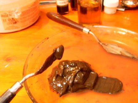
I heeded his warning, and in making all of the paint for this painting, I used the proper safety equipment. The colors were for the most part earth colors, and non-toxic, except of the yellow ocher. For this painting, I used red iron oxide, lapis lazuli, yellow ocher,raw sienna, titanium white, and burnt umber. The pigments were obtained from Sinopia, Maimeri, and several other sources. They were all hand mulled in cold pressed linseed oil, and a little amber varnish, added at the end. The painting is on wood panel, and is varnished with amber varnish, that I made several years ago, and allowed to age. It is enjoyable to make paint, but considering that it took approximately one hour to mull each color, it is so much earier to simply uncap a tube, and squeeze out a paint nut.


These types of paintings are very different than images that I normally paint, yet painting a primitive, in this manner, is almost meditative. It does improve the focus.

Wednesday, January 27, 2010

Asteh Tisi Elaws

Addendum:
Dave passed away June 1, 2011. He will be missed. One day years ago now, I was standing there under a bright spring sun, talking with Dave, and immediately noticed a spider was crawling on his shirt. It was a quite intimidating spider, and I said Dave you have a spider on you, and pointed to it. He looked at it, then lifted it with his finger, stooped down and placed it on the ground. It crawled away. I would have smashed it, and asked him why he did not do likewise. He said that one shouldn't kill something when it was not necessary. I will never forget that. I am grateful for the opportunity to have known Dave. I hope he has found some good stone and some good tools.


This is a portrait of my friend. Dave is a stone sculptor, and painter. His sculptures are in collections across America. I was inspired to paint this, while both of us attended a pow wow at the Saginaw Chippewa reservation, in Michigan, several years ago. I was honored to participate in a two person show with Dave, in August, 2009, at Delaware, Ohio.


Practice Copies of Old Master's Works


Although I haven't copied old masters works for quite some time, I did this one in order to test an amber varnish that I made. It is many layers thick, employing amber in each successive layer. I am sold on hard resins in painting mediums. The luminous qualities are, in my opinion, much different than when using modern resins. The amber I used in this one was from the Baltic region, and was obtained from Kremer. It was made by heat fusing the resin, or in effect running it. It was then combined with linseed oil, under high heat, and then cooked into more oil to make a medium. This was added in small quatities to the oil paint, in gradually increased amounts, with each layer. The light enters the surface, and as it is returns back out after striking gradually built up under layers, it creates a luminous effect that causes it to appear to glow from within.

Practice Copies of Old Master's Works

The above image is 16x20, and was painted in layers. I used Liquin as a medium. The colors were Cobalt blue, Prussian blue, Titanium white, ivory black, cadmium yellow, napthol red, and alizarin crimson. As with the painting below, it was based on a work by Sassoferrato. It was completed quite a few years ago, as a test to see how mediums behave in glazes. I must say that although alkyds can be quite useful, I sure like natural resins much better. The copies have taught me a great deal regarding layers, mediums, colors, glazing, scumbles, and patience. None are done exactly, nor treated or thought of as an original work of art.


As with the above image, this image is one that I have painted several times. It is a copy of a Sassoferrato. Although it is not exact, I like to paint this image when testing a new medium, as it permits me to see how each behaves in a full range of values, and in glazes.


In the past, I used the word amber to refer to both Baltic amber, and to hard copal resins. Although, upon just looking at the raw resin, they can appears simliar, they really are different materials, and create much different effects, when used in paint.


This is an oil painting 11x14 inches. In the underpainting, I used a medium containing oil of spike, and Canada balsam. I wanted a very smooth surface for the later paint layers, and this medium worked wonderfully. For later layers, I used copal, employing slightly greater amounts of linseed oil, with each sucessive layer. I also added a color called Stil de grain, to the varnish, in very small amount, to create a slight patina. Rather than purchase this color (stil de grain) as a separate color, it can easily be mixed by combining something such as Winsor and Newton's Indian yellow, with a touch of raw umber. That way the colors are much more versatile, and can be used for other purposes as well. The copal worked wonderfully, and in the end, although the picture doesn't convey it, it created an enamel like hard glassy surface similar to those I have seen by Flemish masters, in quite a few museums. This is much different than the surfaces produced by alkyd mediums. In the end, I applied a very thin layer of amber varnish, over the entire surface. Several drops, which were subsequently spread out super thin, over the entire surface.